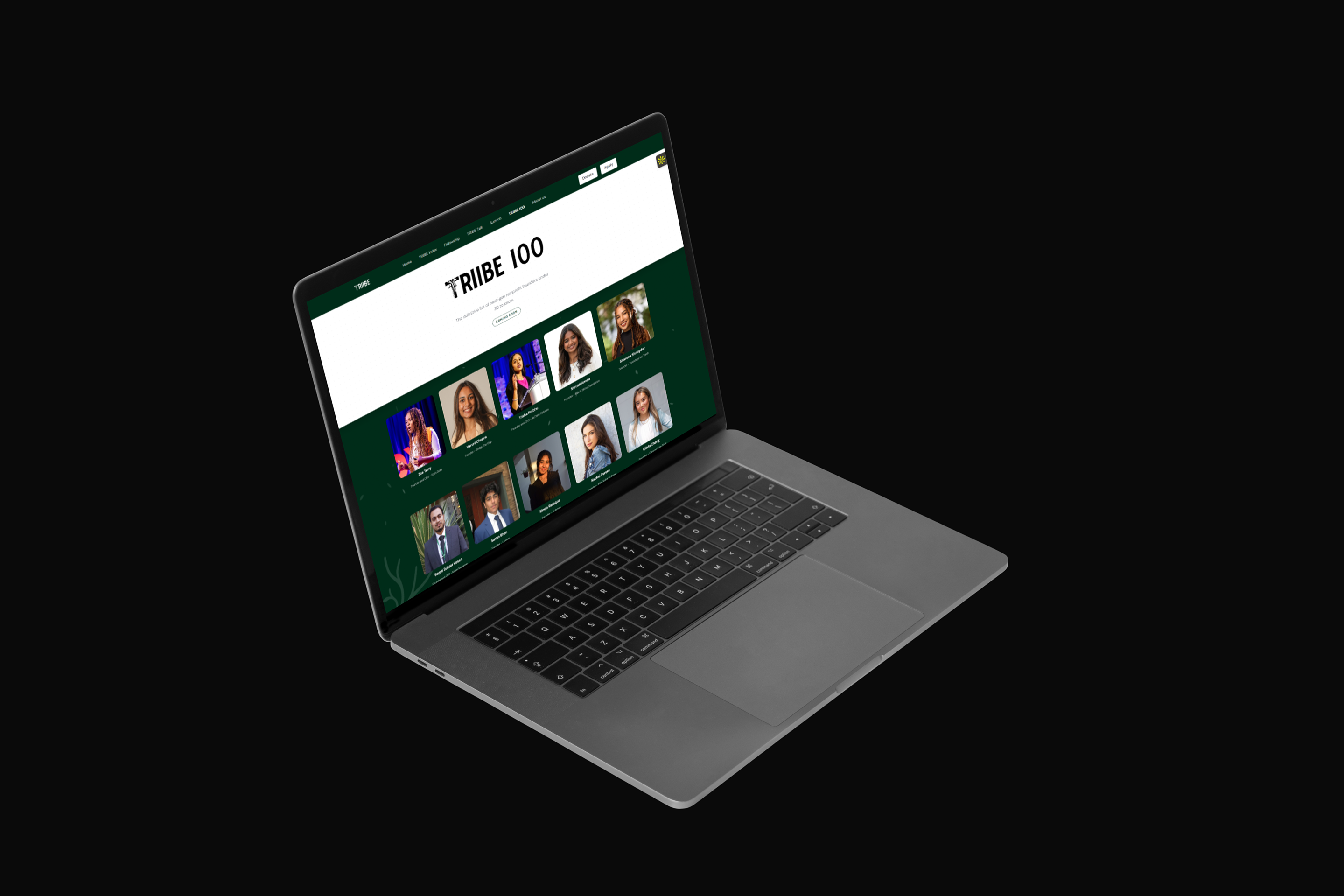
Triibe100
Designed, art-directed, and built by me, with AI.
- Problem
- A prestige list has to feel prestigious. The honoree photos looked flat on their own, and the experience had to feel fresh and unmistakably Triibe across both the website and social.
- My Role
- Solo across the project: visual direction, page design, and front-end build. I art-directed the honoree visuals, vibe-coded the page with Claude Code and VS Code, and carried the system into the social launch.
- Timeline
- Three days total, solo, covering both the page and the social designs.
- Outcome
- Launched live at triibe.org/100 as one coordinated release. The leaf system unified the web page and the LinkedIn, Instagram, and TikTok announcement cards into a single launch.
Overview
Triibe100 is Triibe’s recognition list, our take on Forbes 30 Under 30, spotlighting 100 founders and changemakers. I owned it end to end: the visual direction, the web page, and the social launch.
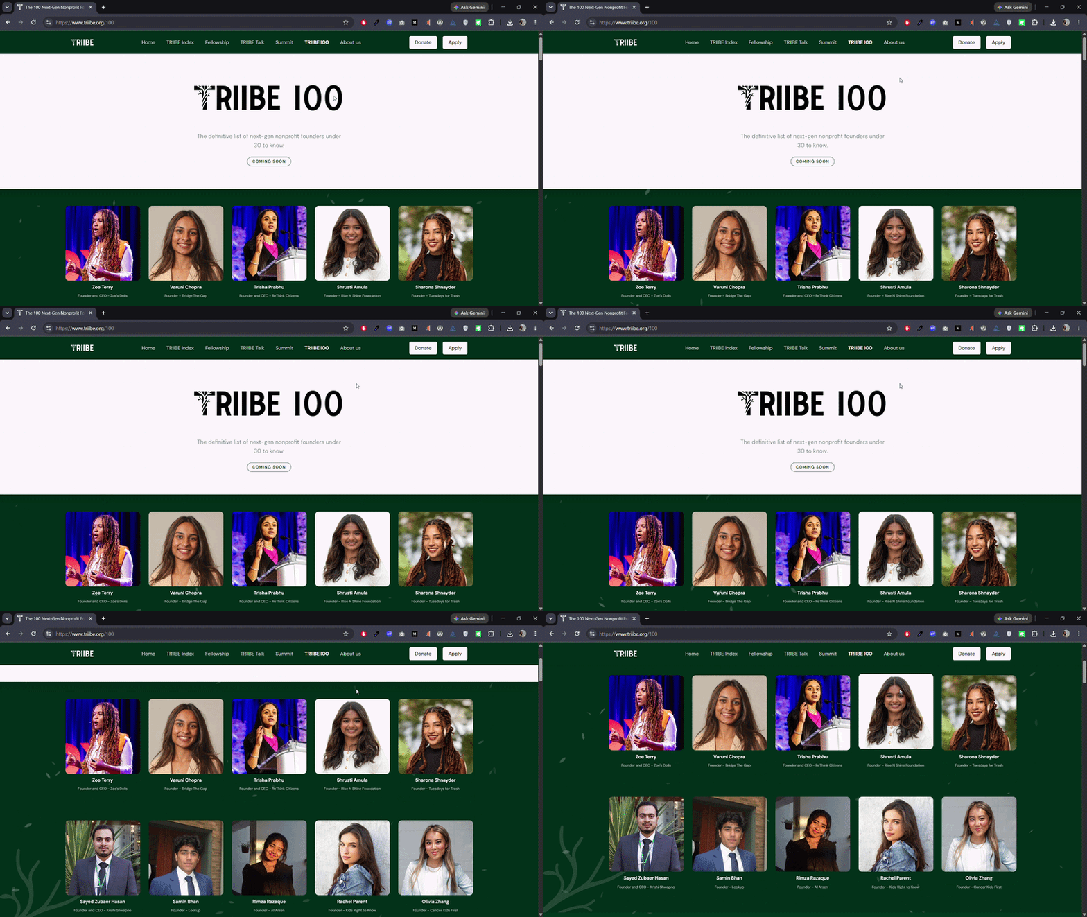
The challenge
A prestige list has to feel prestigious. On their own, the honoree photos looked flat, and the experience needed to feel fresh and unmistakably Triibe across both the website and social.
Finding the visual direction
A prestige list lives by one rule: nothing competes with the people on it. The honorees are the content. Everything else is supporting cast. The page had to feel unmistakably Triibe and feel prestigious without any element pulling focus from the names. Three directions tested that rule. Two broke it.
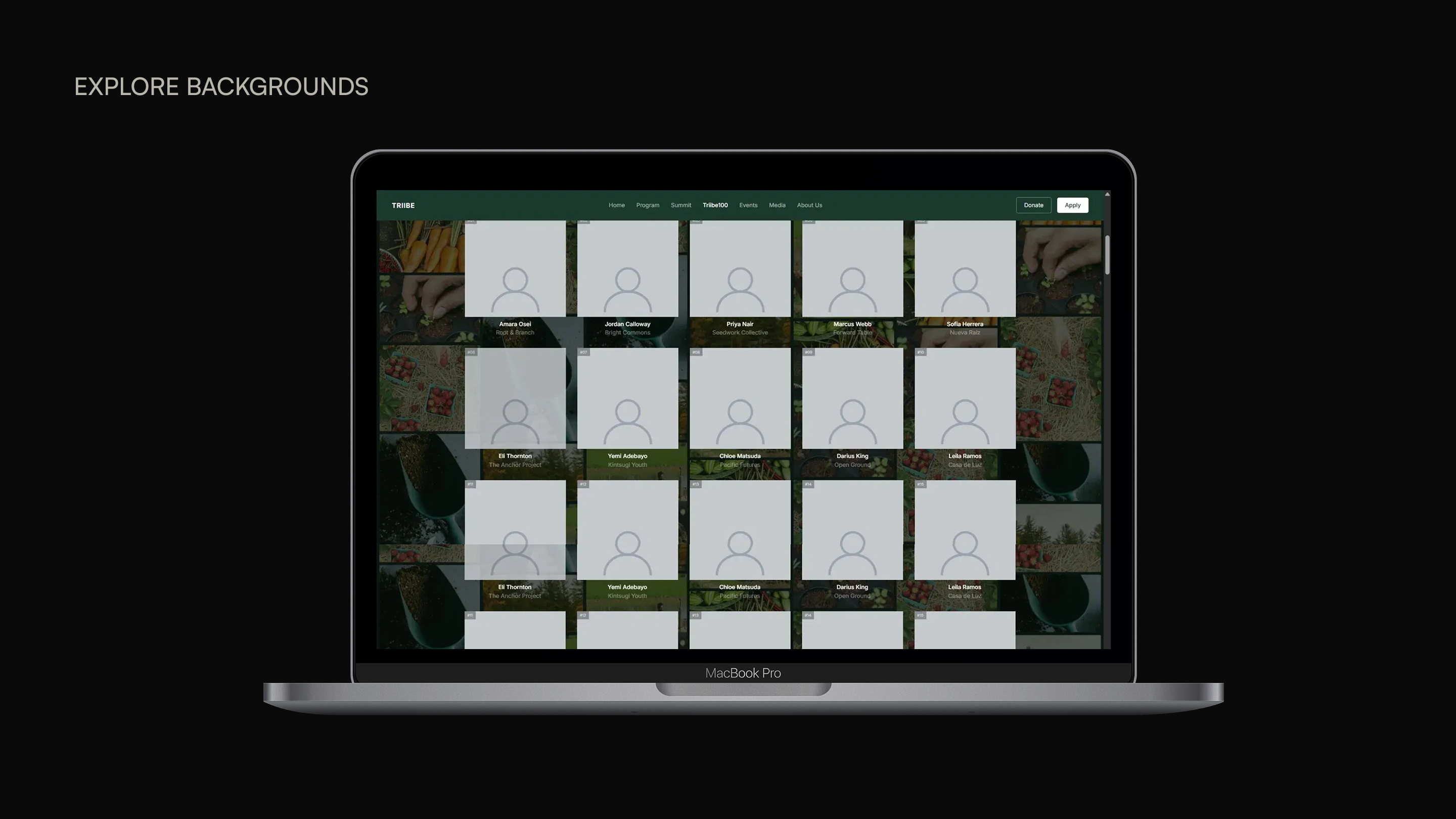
Themed category backgrounds
The list was first organized around five categories, each section carrying its own environmental imagery generated with AI from Unsplash sources. The backgrounds were busy and chaotic. They competed with the honorees and broke Triibe’s minimalism. When the five categories were cut company-wide, the structure they supported went with them.
Animated branches
With the page now too plain, I tried Triibe’s signature branches as a scroll-driven animation, a trunk that grew new branches as the user moved down the list. Made literal and animated, the branches read as twiggy scaffolding. They competed with the names instead of supporting them.

Leaves behind the honorees
Both failures shared one cause: every element placed beside the honorees fought them. So I took the most recognizable Triibe asset, the branch, and moved it behind the people instead of around them, reduced to subtle floating leaves that add depth without pulling focus. The brand stays present. The names stay first.
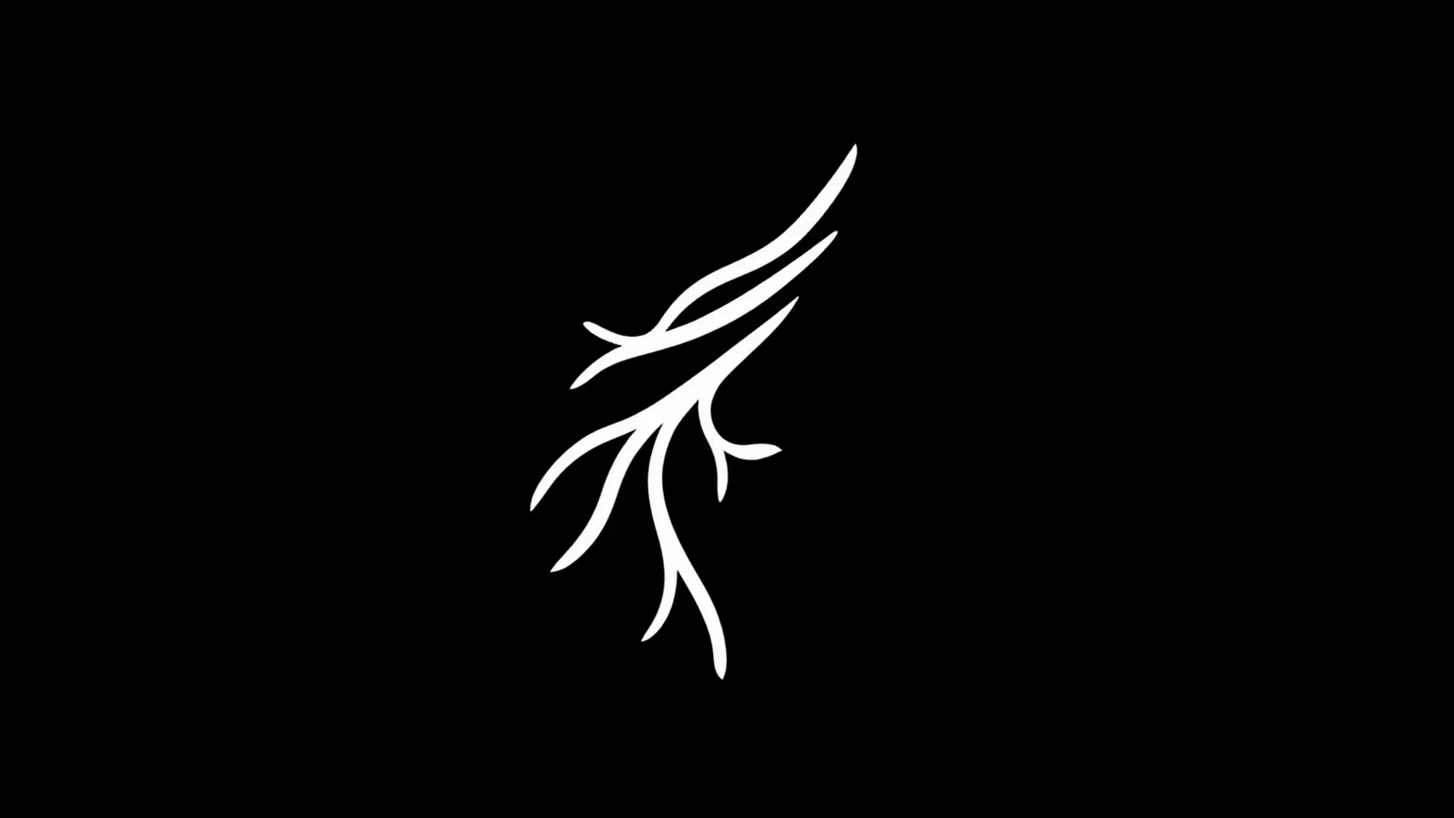
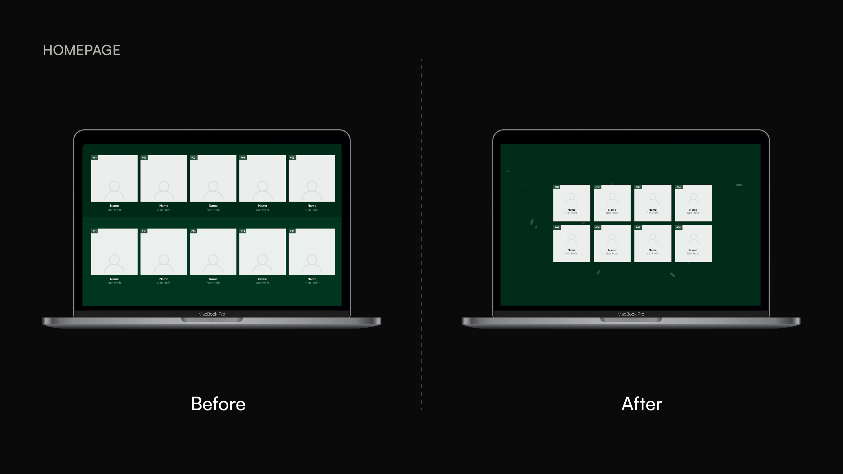
The brand frames the honorees, it never competes with them. Triibe’s signature branch earns its place on the page only when its volume is turned down.
One launch, every surface
The launch was not only the web page. I designed one announcement card on the same leaf system and ran it across LinkedIn, Instagram, and TikTok, so the site and the posts read as one coordinated launch rather than separate assets.

LinkedIn · Instagram · TikTok
Built with AI
I designed the visual direction and the announcement card in Figma, then vibe-coded the page myself with Claude Code and VS Code, art-directing the build to final.