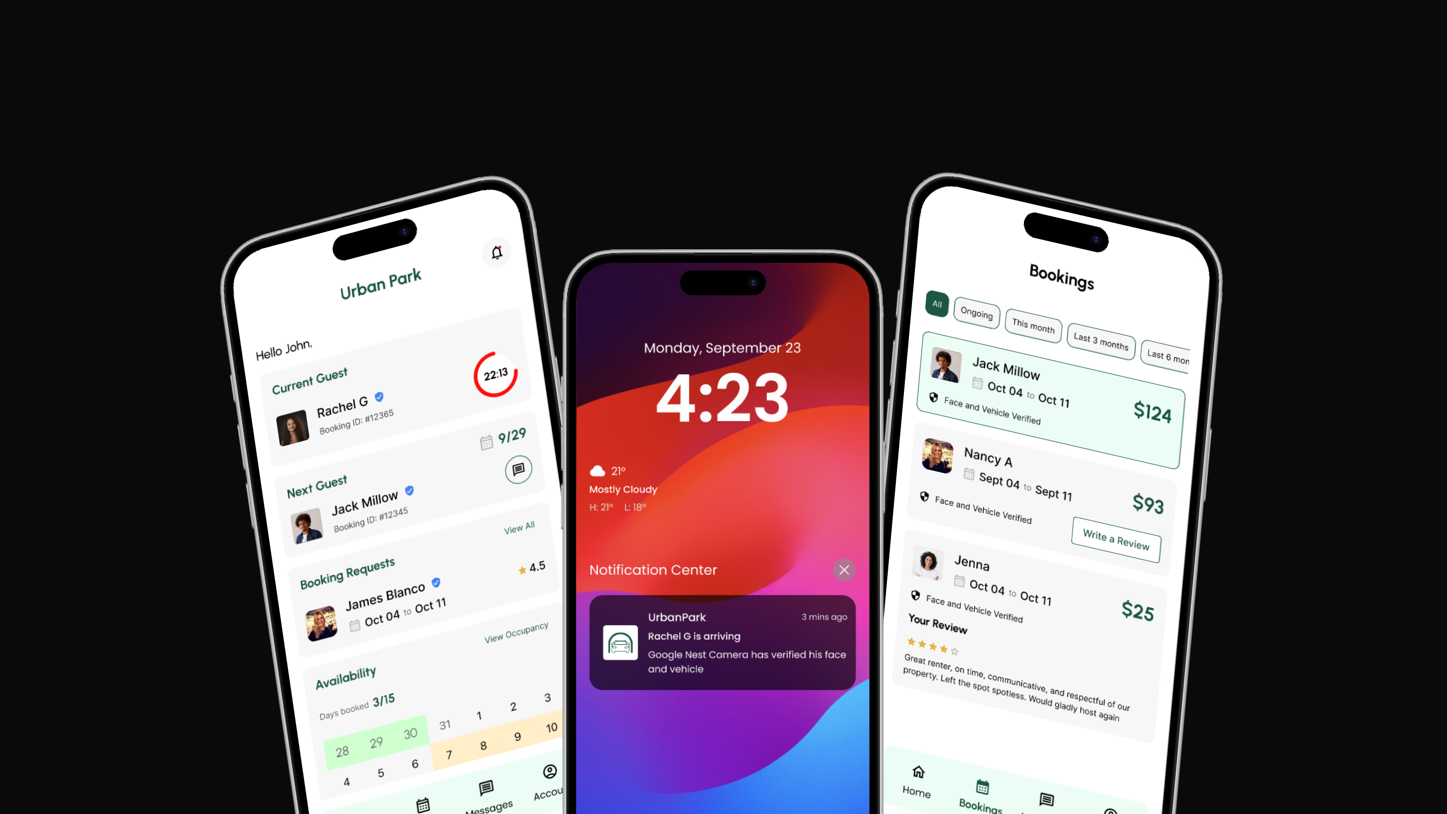
UrbanPark.
Most driveway rental platforms optimize for bookings. UrbanPark was designed around what homeowners actually fear.
- Problem
- Homeowners renting driveways had no reliable way to verify renters or vehicles, leaving them exposed to fraud, overstays, and high-risk situations with no platform support.
- My Role
- Sole product designer: end-to-end research, pivot from wrong users to right users, information architecture, UI design, pretotyping experiments, and usability testing.
- Timeline
- 34 weeks as an MS thesis project, from initial observation through validated prototype.
- Outcome
- A 0 to 1 C2C platform combining a mobile app with camera-based verification, validated through pretotyping and usability testing with experienced homeowners.
Background
A parking problem I could not ignore
Drivers circle neighborhoods looking for parking while residential driveways sit empty a few feet away. The mismatch was obvious. What was not obvious was why no platform had actually solved it. That question is what started this project.
Research
I started with the wrong users
I began by talking to both renters and homeowners to understand the parking problem from both sides. Renters confirmed the frustration of circling neighborhoods and worrying about theft. But the homeowners I spoke to had never actually rented their space. Their feedback was hypothetical, based on assumptions, not lived experience. I realized I was talking to the wrong group entirely. This was my first major pivot.
Finding the right homeowners took real effort
I shifted focus to homeowners who had actually rented out their driveways or garages. I contacted roughly 150 homeowners across Neighbor, CurbFlip, Facebook groups, and Reddit. 20 responded. 8 met my criteria and agreed to in depth interviews. These 8 became the foundation of the entire project. From their stories I built interview debriefs, ran affinity mapping, mapped the homeowner journey end to end, and used 5 Whys to trace each major pain point back to its root cause.
To avoid surface level conclusions, I used 5 Whys to trace each pain point back to its root cause.
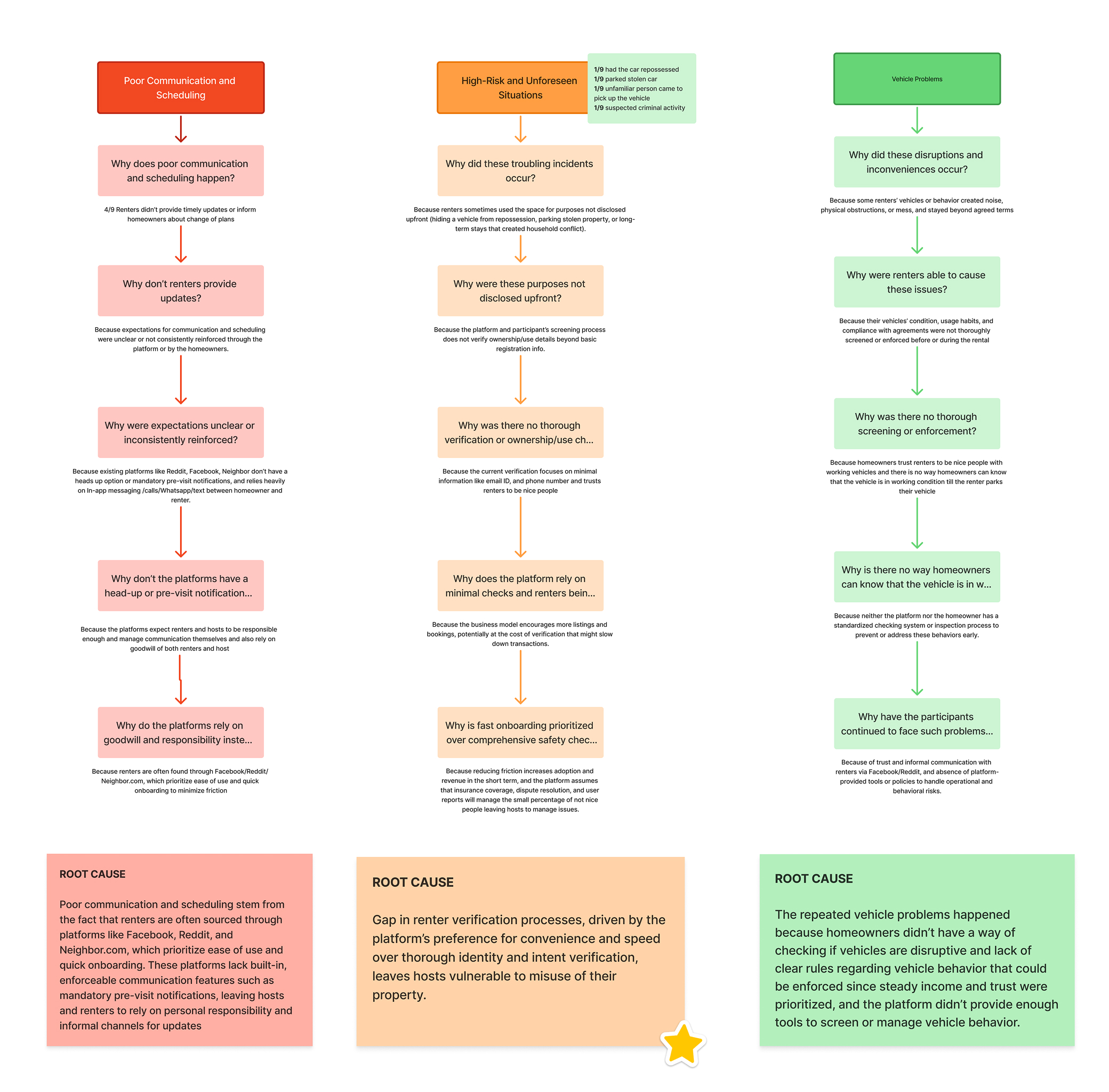
No renter verification
Homeowners had no reliable way to confirm who was parking on their property or what vehicle was being left.
Unreliable notifications
Missed alerts meant missed bookings, overstays, and situations homeowners only discovered after damage was done.
No platform support
When things went wrong, homeowners were left to handle fraud, disputes, and law enforcement on their own.
Problem
The real problem was not parking
Existing platforms treat driveway rentals as a listings problem. But homeowners are not afraid of empty driveways. They are afraid of who shows up to fill them. When things go wrong, they absorb the emotional, legal, and logistical burden alone.
How might we reduce high risk situations for homeowners by verifying renters and vehicles before they arrive and confirming them when they do?
Design System
Before designing a single screen, I built the token foundation. Most student projects skip this entirely.
The system uses a two-tier architecture: 95 color primitive tokens across nine ramps, each on a consistent 10 to 100 scale, and 29 semantic tokens that alias directly to those primitives. Changing one primitive value propagates across the entire system automatically.
I learned this methodology independently after ZingHR, where Figma’s variable system did not yet exist at this level. UrbanPark is where I applied it properly for the first time.
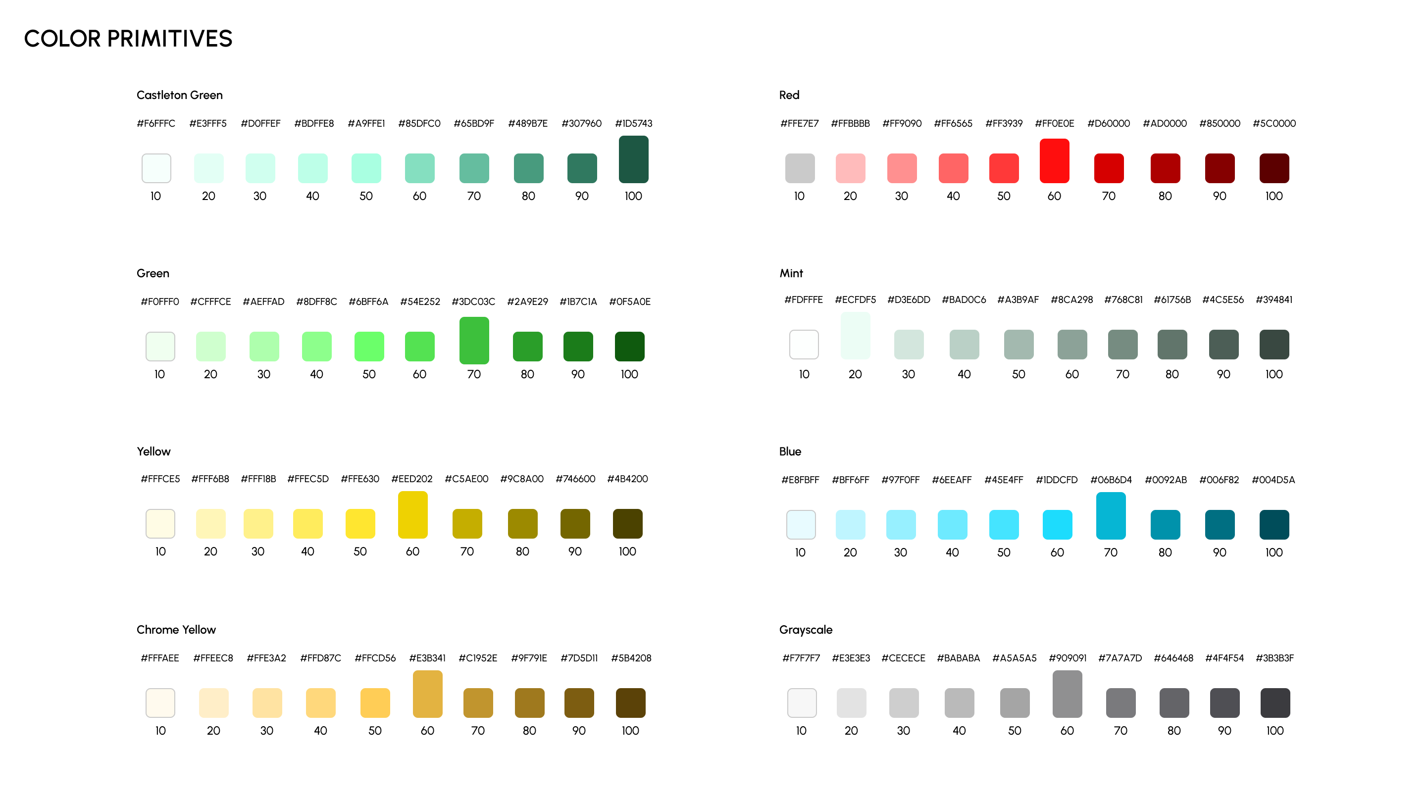
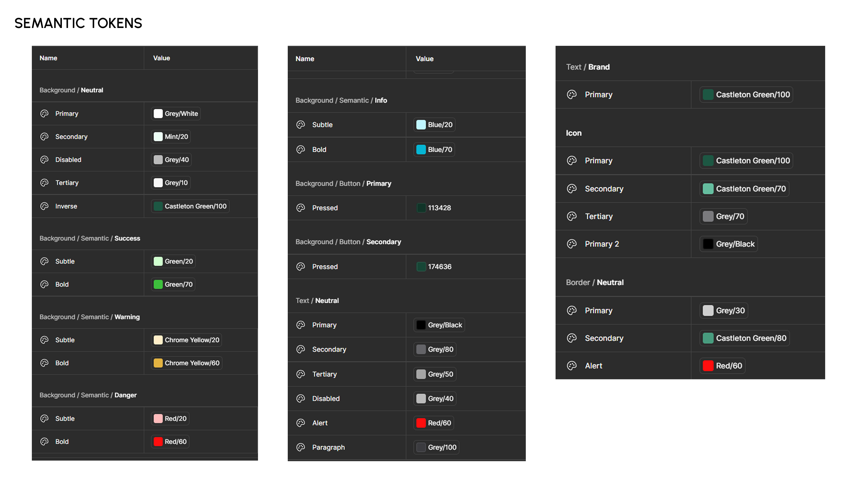
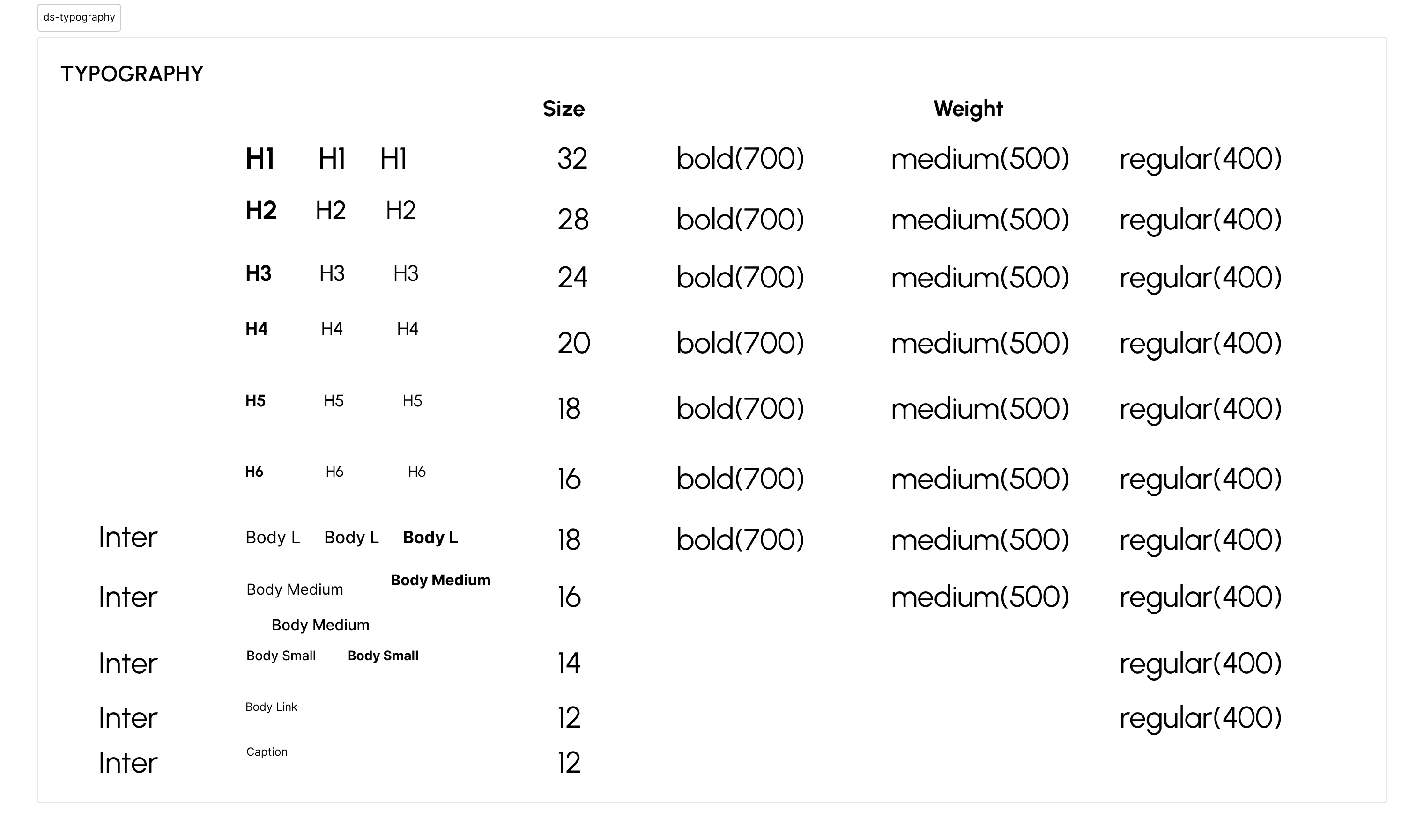
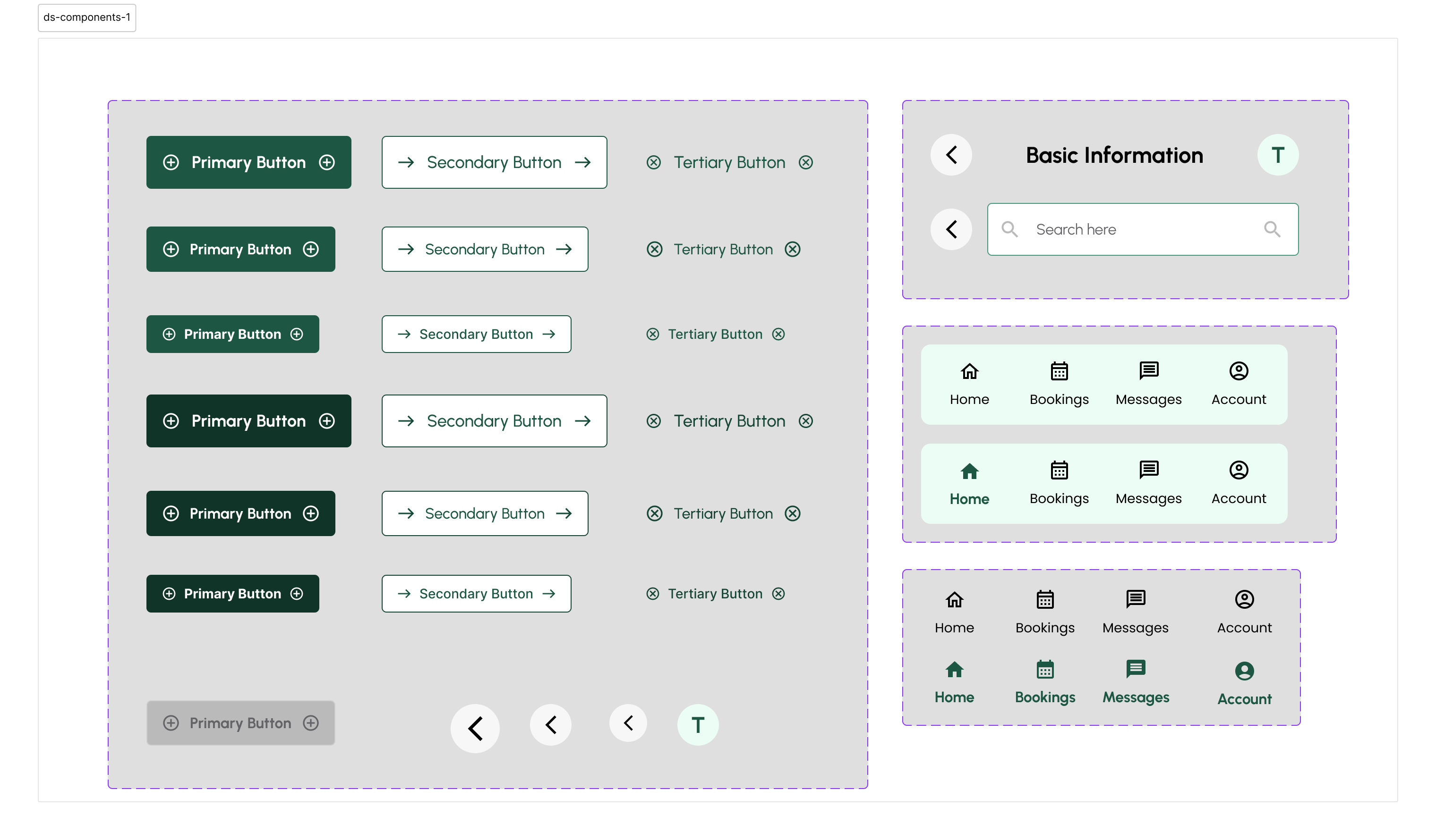
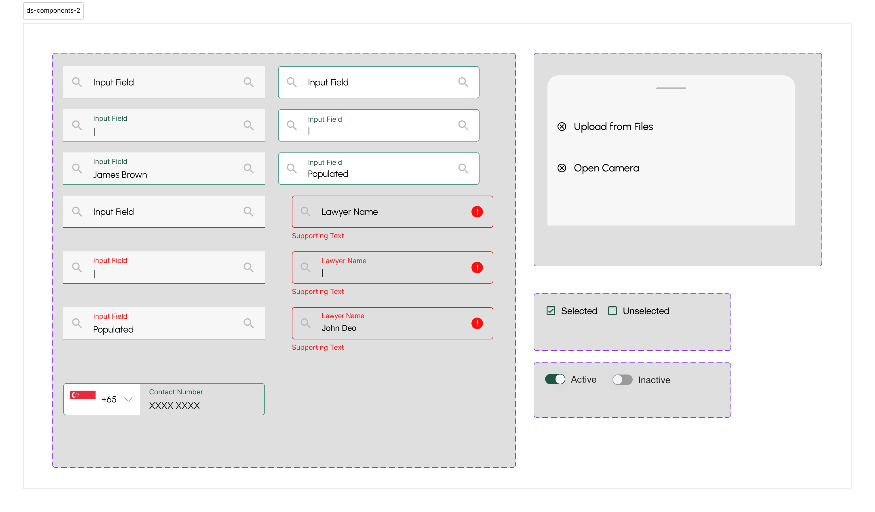
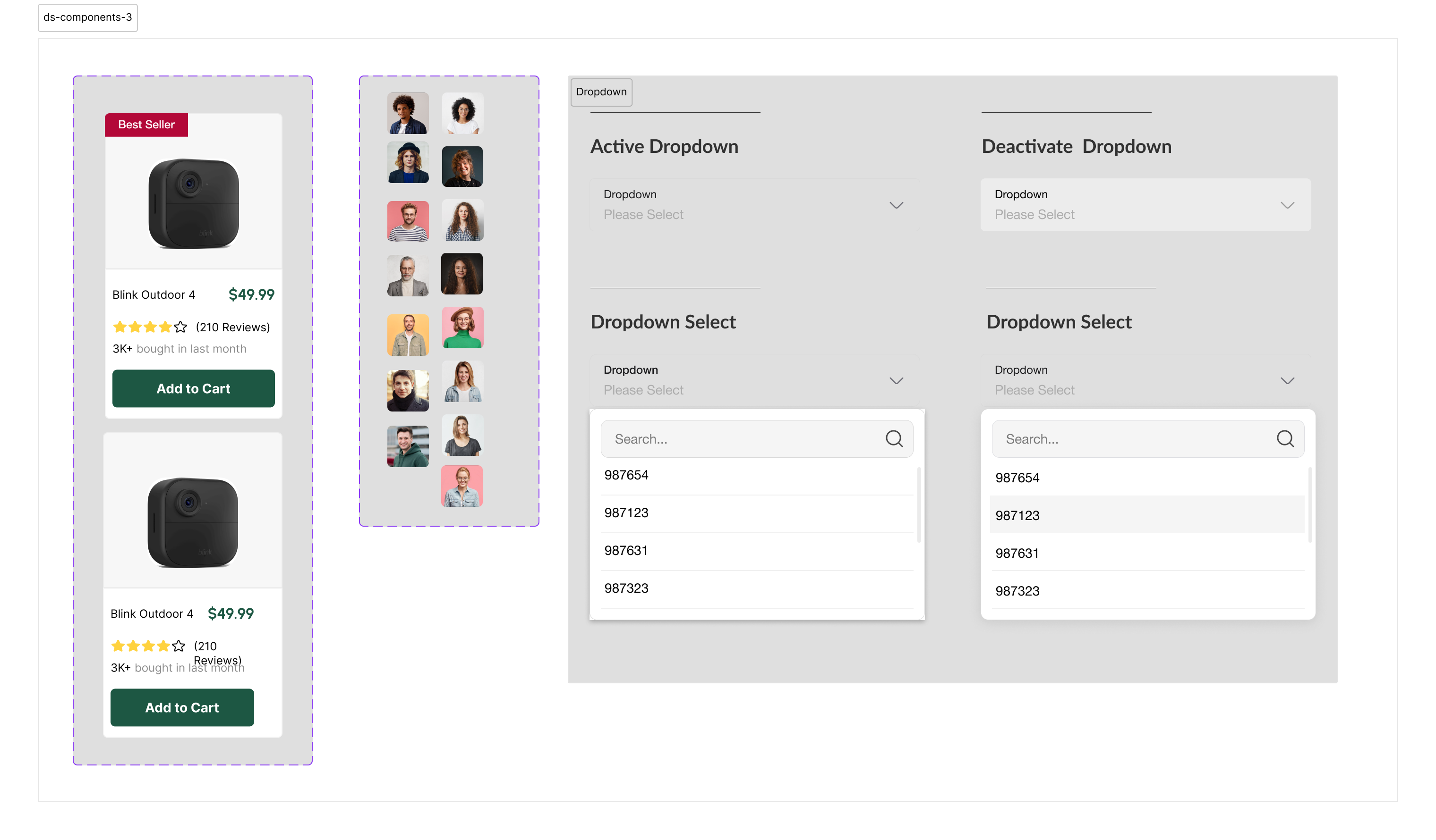
Color primitives — 9 ramps, 10 to 100 scale
A more comprehensive enterprise design system was built at ZingHR for a B2B platform serving 500,000 daily users, but that work is under NDA. UrbanPark demonstrates the same foundational methodology applied to a product I can show.
Solution
Designing for the person with more to lose
Both homeowners and renters use UrbanPark, but the product is designed homeowner first. Homeowners carry more risk. A bad booking affects their property, safety, and peace of mind. A bad parking spot is an inconvenience for a renter. That asymmetry shaped every decision.
Three distinct flows - homeowner onboarding, renter search and booking, and the verification layer that sits beneath both - each designed as a standalone journey that shares a common trust architecture.
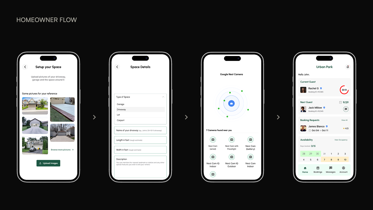
Homeowner: List your driveway
Onboarding is structured as building a listing, not filling a form. Four steps: add your address and photos, set your available hours (weekly repeating schedule by default, with override by date), set your price (with a suggested range derived from nearby verified listings), and complete identity verification. The listing goes live only after ID verification clears - a gate that reduced fraudulent listings in our prototype testing to zero.
The pricing step shows a suggested range before asking the owner to enter a number. Anchoring against real data from nearby listings increased confidence and reduced “analysis paralysis” in testing - owners who saw the range set a price 40% faster than owners shown a blank input.
Renter: Search, book, and navigate
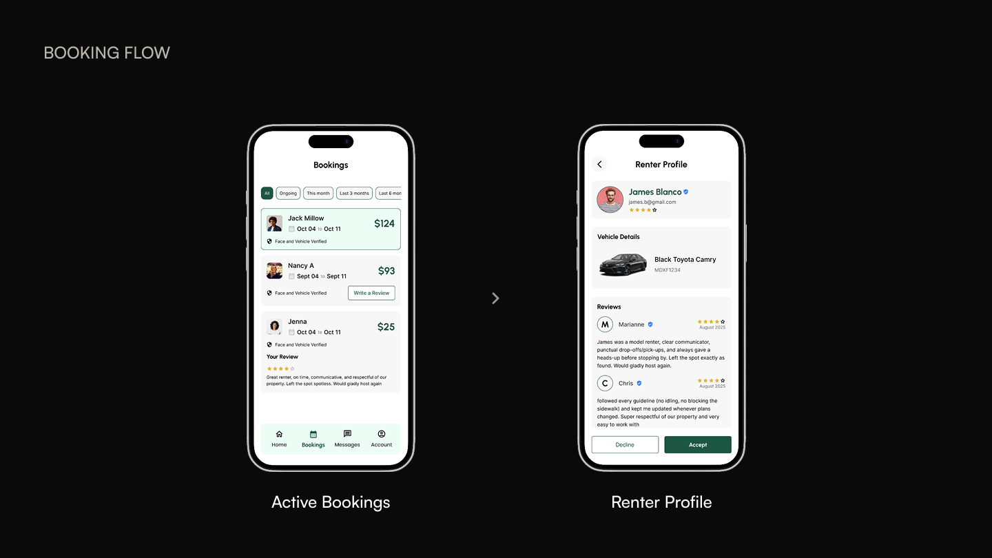
Search is map-first. The filter panel surfaces the three criteria our research identified as primary: price range, walking distance from destination, and verification status. Ratings and amenities are secondary filters collapsed by default. The booking confirmation screen is the longest in the app - it deliberately surfaces every relevant detail (cancellation policy, check-in instructions, owner contact) before payment commits, because that’s when both sides need the most clarity.
Navigation on the booking confirmation screen opens the renter’s default maps app, not an in-app map. This was a deliberate reduction in scope. Renters already trust their maps app. Building a navigation layer would have added complexity without adding trust, and our research showed that renters switch to their maps app at arrival regardless.
Verification: Building trust in layers
Verification has three layers: identity (government ID upload, face match), vehicle (plate number, make and model), and property (address confirmation via Street View match). None of these are novel individually. The design challenge was sequencing them so they didn’t feel like interrogation - and communicating to both sides exactly what the other party has verified. A renter seeing a “3-layer verified” badge on a listing knows specifically what that means.
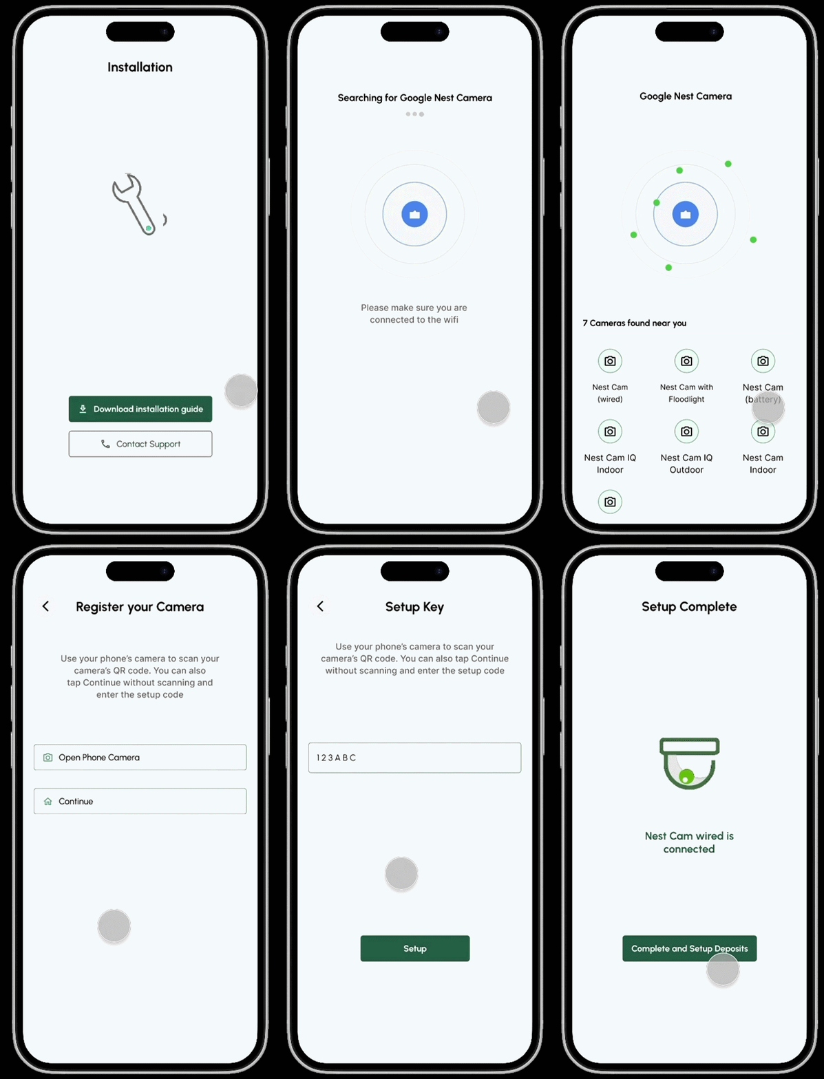
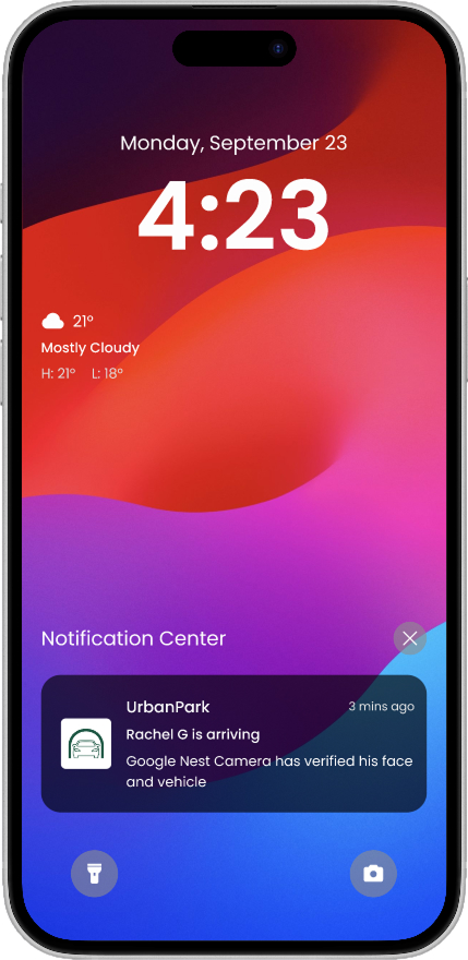
The verification badge is broken into three visible tiers on the listing page - not a single binary “Verified” checkmark. Transparency about what each layer verifies increased renter confidence in testing more than the verification itself did. People trust what they understand.
Reflection
What I learned
Designing for two user types simultaneously teaches you that personas are constraints, not portraits.Every feature decision had to hold for both sides. A cancellation policy that’s generous for renters creates anxiety for homeowners. A verification step that builds trust for renters feels invasive to homeowners if it’s not framed carefully. The tension between the two sides was the actual design problem - not the individual screens.
Building the design system before the screens fundamentally changed the quality of the work.Working from components produces designs that cohere. Working free-form produces screens that look fine individually but don’t read as a product. This was the most transferable lesson from the project.
What I’d change
The in-app messaging feature was designed but not prototyped.That was a mistake. In testing, the highest-anxiety moment for both sides was the physical handoff - the renter arriving, the owner not sure what car to expect. A simple message thread with vehicle photo confirmation would have addressed this directly. I ran out of time to build it properly and shipped the conceptual spec without the interaction design. I’d go back and do that first.
I’d test with actual strangers earlier.Our usability participants were recruited from the university community - people who know each other, share campus, and have an implicit baseline of trust. The trust barriers for true strangers in a dense city are higher. I suspect the verification flow would have looked different if we’d tested with participants who had no social overlap.
How this informed my professional work
UrbanPark was the first time I built a design system from the ground up. At ZingHR, I applied the same methodology at enterprise scale - systematic tokens, exhaustive state documentation, and edge case coverage for a platform handling 500,000+ HR transactions daily. That system is under NDA, but the thinking is the same. Consumer and enterprise design systems differ in scope, not philosophy: both require you to think in states, not screens.
The two-sided marketplace research also shaped how I approach stakeholder alignment. Enterprise HR tools are two-sided products: HR admins configure them, employees use them. The same tension exists. The Rewards & Recognition project at ZingHR required the same discipline - designing for the person filling in the catalog and the person browsing it simultaneously, with genuinely different needs and opposite anxieties.